Typography/ Task 1: Exercises
2.9.2022 - 7.10.2022 / Week 1 - Week 6
Sylvia Lau (0356130)
Bachelor of Design (Hons) in Creative Media
Task 1 / Exercises
LECTURES
Lecture 1
Typography: Development
Early Letterform Development
Figure 1.1 The evolution of letters from Phoenician
Figure 1.2 Boustrophedon
Boustrophedon is a style writing that developed by the Greek, which meant the text will be read from right to left and left to right. They also changed the orientation of the letterforms.
Figure 1.3 Hundred years of development from Phoenician to Roman
Hand Script from 3rd- 10th century C.E
Figure 1.4 Square Capitals
These letterforms have serifs added to the finish of the main strokes.
Figure 1.5 Rustic Capitals
These letterforms took less time to write, however it was slightly harder to read because of their compressed nature.
Figure 1.6 Roman Cursive
These letterforms were simplified for speed.
Figure 1.7 Uncials
Uncials didn't have lowercase and uppercase letterforms, they incorporate the capitals and lowercase into the writing system. The broad forms of Uncials are more readable at small size than rustic capitals.
Figure 1.8 Half Uncials
It mark the formal beginning of lowercase letterforms, replete with ascenders and descenders.
Figure 1.9 C.925: Caloline Miniscule
Charlemagne: The first unifier of Europe since Romans. He introduced uppercase letters, lowercase letters, capitalization and punctuation which standardized writing systems and also convey messages more accurately.
Black Letter to Gutenberg's Type
Blackletter is a condense strongly vertical letterforms which gained popularity in northern Europe. However, Rotunda gained popularity in the south. Both letterforms were developed after the dissolution of Charlemagne's empire.
Gutenberg marshaled them all to build pages that accurately mimicked the work of the scribe's hand- Blackletter of northern Europe. Gutenberg's type mold required a different brass matrix, or negative impression for each letterform.
Text Type Classification
Lecture 2
Typography: Text
Kerning and Letterspacing
Kerning refers to the automatic adjustment of space between letters. Letterspacing means to add space between the letters. Tracking refers to the additional and removal of space in a word.
Designers always letterspace uppercase letters because uppercase letterforms are drawn to be able to stand on their own. Whereas lowercase letterforms require the counter form created between letters to maintain the line of reading.
Formatting Text
Its most closely mirrors the asymmetrical experience of handwriting. Spacing between words are consistent throughout the text, allowing the type of create an even gray value. Flush left have a ragged right and it is important to always make the ragging on the right smooth, which mean a little bit of curve.
As centered type create such a strong shape on the page, its important to amend line breaks so that the text does not appear too jagged.
This format places emphasis on the end of a line as opposed to its start. It can be useful in situation like caption because it might be ambiguous without a strong orientation to the right.
Justified is achieved by expanding or reducing spaces between words and sometimes between letters. The resulting openness of line can occasionally produce 'rivers' of white space running vertically through the text. Careful attention to the line breaks and hyphenation is required to amend this problem.
Texture
Different typefaces suit different messages. Type with a relatively generous x-height or relatively heavy stroke width produces a darker mass on the page than type with a relatively smaller x-height or lighter stroke. Sensitivity to these differences in colour is fundamental for creating successful layouts.
Leading and Line Length
The goal in setting text type is to allow for easy reading, at the same time a field of type should occupy the page as much as photograph does.
Type Size: Should be large enough to be read easily at arm length.
Leading: Text that is too tightly encourages vertical eye movement ( a reader can easily looses his or her place). Text that is too loosely creates striped patterns that distract the reader.
Line Length: Appropriate leading for text is as much a function of the line length as it is a question of type size and leading. A good rule of thumb is to keep line length between 55-65 characters.
Type Specimen Book
Lecture 3
Typography: Text
Indicating Paragraphs
Several options for indicating paragraph:
A holdover from medieval manuscripts seldom use today.
When typeface is 10pt, the leading space will be 12pt, the paragraph spacing should be 12pt. The purpose is to maintain cross alignment.
The indent is the same size of the line spacing or the same as the point size of your text. Indentation is best used when the text is justified, it should never used when the text is left alignment and ragging on the right.
It creates unusually wide columns of text. There can be strong compositional or functional reasons for choosing it
Widows and Orphans
Widows and orphans are two unpardonable gaffes. A widow is a short line of type left alone at the end of a column of text. An orphan is a short line of type left alone at the start of the new column.
The solution to widows is to rebreak your line endings through out your paragraph so that the last line of any paragraph is not noticeably short.
Highlighting Text
Headline within text
A head indicates a clear break between the topics within a section. A heads are set larger than the text, in small cap and in bold. B heads indicate a new supporting argument. As such they should not interrupt the text as strongly as A heads do. C heads are not common, but it highlights specific facets of material within B head text. They not materially interrupt the flow of reading. C heads in this configuration are followed by at least an em space for visual separation.
Cross Alignment
Cross aligning headlines and captions with text type reinforces the architectural sense of the page - the structure - while articulating the complimentary vertical rhythms.
Lecture 4
Typography: Basic
Describing Letterforms
The Fonts
Describing Typefaces
Comparing Typefaces
Two goals: Easy readability and an appropriate expression of contemporary esthetics.
Beyond the gross differences in X-Height, the forms display a wealth of variety, in line weight, relative stroke widths and in feeling. These feelings connote specific use and expression. It is important to choose an appropriate typeface when conveying and presenting a message.
Lecture 5
Typography: Letters
Understanding Letterforms
Uppercase letterforms above suggest symmetry, but it is not symmetrical. Each bracket connecting the serif to the stem has a unique arc.
The uppercase letterform may appear symmetrical, but the width of the left slope is thinner than the right stroke.
The complexity of each individual letterform is neatly demonstrated. Figure above show a comparison of how the stems of the letterforms finish and how the bowls meet the stem quickly reveals the palpable difference in character between the two.
Maintaining X- Height
X- Height generally describe the size of the lowercase letterforms. However, curved stroke, such as 's', must rise above the median or sink below the baseline in order to appear to be the same size as the vertical and horizontal stroke they adjoin.
Counter Form
Just as important as recognizing specific letterforms is developing a sensitivity to the counter form - the space describes, and often contained by the strokes of the form.
One of the most rewarding way to understand the form and counter of a letter is to examine them in close detail. It provide a good feel for how the balance between form and counter is achieved, which also give a glimpse into the process of letter making.
Contrast
The basic principles of Graphic Design apply directly to typography, for example Contrast. The simple contrasts produces numerous variation: small + organic/ large + machined; small + dark/ large + light.
Lecture 6
Typography: Different Medium
Print Type VS Screen Type
Type for Print:
Most common typefaces that is used for print is Caslon, Garamond, Baskerville. As these typefaces are elegant and intellectual but also highly readable when in small font size.
Type for Screen:
Typefaces intended for use on the web are optimized and often modified to enchance readability. This include a taller X-Height, wider letterforms, more open counters, heavier than strokes and serifs, reduce stroke contrast, as well as modified curves and angles for some design. Another important adjustment is more open spacing. All these factors serve to improve character recognition and overall readability in the non- print environment.
Hyperlink:
A word, phrase, or image that can click on to jump to a new document. Hyperlink are found in nearly all web pages. Text hyperlinks are normally blue and underlined by default.
Font size for screen:
16 pixel text on a screen is about the same size as text printed in a book or magazine; because we read books pretty close, only a few inches away, they are typically set at about 10 point.
System Fonts for Screen/ Web Safe Fonts:
Each device comes with its own pre-installed font selection, which is base largely on its operating system. Windows- based devices might have one group. While Mac OS ones pull from another. Then Google's own Android system uses their own as well.
Pixel Differential Between Devices:
The screen used by our PCs, tablet, phones and TVs are not only different sizes, but the text you see on-screen differs in proportion too, because they have different sized pixels.
Static VS Motion
Static typography has minimal characteristic in expressing words, from billboards to posters, magazines to fliers, we encounter all forms of static typography with wide ranging purposes.
Motion graphics particularly the brand identities of film and television production companies, increasingly contain animated type. Type is often overlaid onto music videos and advertisements, often set in motion following the rhythm of a soundtrack. It has developed to become expressive, helping to establish the tone of associated content or express a set of brand values.
INSTRUCTIONS
Task 1: Exercise 1 -Type Expression
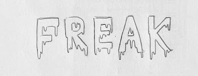
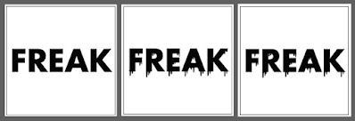
For this exercise, we are given to choose four words to do type expression from these six words - fire, shatter, ring, tall, whisper, freak. We are required to use the 10 typefaces which are provided to finish the task.
Sketches:
Figure 1.1 Sketch of the word "Shatter" 8/9/2022 (week2)
As far as I understand this word, which mean break suddenly and violently into pieces, I decided to design some part of the word that were shattered into pieces and falling apart like a broken glass.
- Font size: between 8 to12pt
- Characters in each line: between 55-65
- Leading: according to font size and +2
- Kerning: change kerning/tracking from 20 to 5 in unit and increments, press alt + </> for kerning but not more than 3 times
- Paragraph spacing: same as leading, must specific pt
- Hyphenation turn off
- Cross alignment maintain


.jpg)


Comments
Post a Comment